What is Conjoint Analysis? A Complete Guide with Examples
Conjoint analysis shows what customers value by making them choose between product options. Learn how it works, its types, an example and how to read results.
In brief
Conjoint analysis is a survey method that shows what customers truly value. Instead of asking them to rate features one by one, it asks them to choose between complete product options. Each choice forces a trade-off, the way a real purchase does. The results show how much each feature and each price point drives the decision. Brands use conjoint analysis to set prices, decide which features to build and predict how a new product will perform against competitors.
What is conjoint analysis?
Conjoint analysis is a quantitative research method that measures how much value buyers place on each feature of a product or service. The meaning of conjoint analysis is in its name: It looks at features considered jointly, as a buyer sees them in a real product, rather than one at a time.
In simple terms, it is a survey that shows people a series of product options, asks which they would choose each time, and works out from those choices how much every feature contributed to the decision. The method is also called trade-off analysis or choice modelling. Paul Green at the Wharton School developed its use in marketing. The method exists because direct questions mislead. Ask buyers whether price, quality, battery life and design matter, and they say all of them do, because agreeing costs them nothing. Conjoint analysis removes that option by making every answer a choice, so something always has to be given up.
Conjoint analysis at a glance
| Question | Answer |
|---|---|
| Also known as | Trade-off analysis, choice modelling, discrete choice experiment |
| What respondents do | Choose between complete product options, several times over |
| What it measures | How much each feature and price point drives choice |
| Main outputs | Part-worth utilities, attribute importance, willingness to pay, market simulator |
| Typical number of features tested | 4 to 8 attributes, each with 2 to 8 levels |
| Typical sample | 400 respondents recommended, 250 at minimum, with enough in each group to be read separately |
| Best for | Pricing, feature priorities, pack and bundle design, new product launches |
| Weakest for | Emotional or brand-led decisions, and markets too small to survey |
How does conjoint analysis work?
Conjoint analysis builds realistic product options from a set of features, shows them to buyers in small groups, and records which one each buyer picks. Almost every study follows the same six steps:
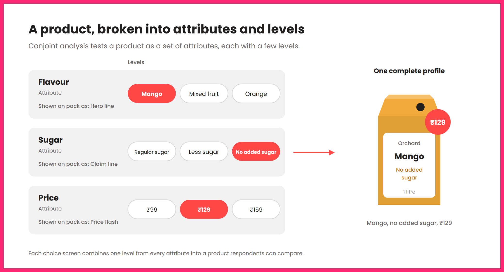
- Choose the attributes: These are the features that vary between options, such as flavour, sugar content or price.
- Set the levels: Each attribute gets a few specific values, such as ₹99, ₹129 and ₹159 for price.
- Build product profiles: The survey combines one level of each attribute into a complete product option.
- Show choice tasks: Respondents see three or four profiles side by side and pick the one they would buy, or choose ‘I would not buy any of these.
- The survey shows a new set of profiles each time. On Flickly a study shows 12 screens by default, including 2 holdout screens, and can run anywhere from 6 to 16.
- Analyse the choices: The pattern of choices across all respondents shows how much each level added to or took away from a product’s appeal.
Every choice is a trade-off. To get the lower price, the respondent gives up a feature. To get the better feature, they accept a higher price. That is how real buying works, which is why conjoint results are more reliable than ratings.
Conjoint analysis terms explained
| Term | What it means |
|---|---|
| Attribute | A feature that varies between product options, such as price or battery life |
| Level | A specific value of an attribute, such as 40 hours of battery life |
| Profile | One complete product option, made of one level from each attribute |
| Choice task | One screen showing several profiles, from which the respondent picks one |
| None option | A choice to buy none of the profiles shown, as people can in real life |
| Part-worth utility | A score showing how much one level adds to or takes away from a product’s appeal |
| Attribute importance | The share of the decision each attribute accounts for, as a percentage |
| Willingness to pay | How much more buyers would pay for one level over another, in rupees |
| Market simulator | A model that predicts which product buyers would choose in any line-up you set |
| Holdout screen | A screen shown to every respondent but kept out of the model, used to check how well the model predicts real choices |
Types of conjoint analysis
The types of conjoint analysis differ in how respondents give their answers. Choice-based conjoint analysis is the most widely used, because choosing one option is closest to a real purchase.
| Type | How it works | When to use it |
|---|---|---|
| Choice-based conjoint (CBC) | Respondents pick one profile from a set of 2 to 4, across several rounds | Most pricing and feature decisions |
| Adaptive conjoint | The survey changes its questions based on each respondent’s earlier answers | Studies with many attributes, 10 or more |
| Full-profile conjoint | Respondents rate or rank complete profiles rather than choose between them | Small studies, mostly older research |
| Menu-based conjoint | Respondents build their own product by picking options from a priced menu | Bundles, add-ons and products customers configure themselves |
| Best-worst conjoint | Respondents pick the best and worst profile in each set | Features that can draw both positive and negative reactions |
MaxDiff is sometimes listed as a type of conjoint. It ranks single items rather than complete products and has no price attribute, so it is a related method rather than true conjoint.
Conjoint analysis example: Pricing a new packaged juice
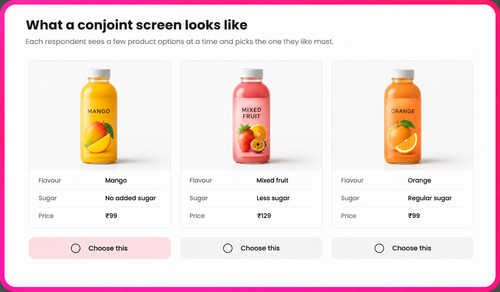
| Attribute | Levels |
|---|---|
| Price | ₹99, ₹129, ₹159 |
| Flavour | Mango, mixed fruit, orange |
| Sugar | Regular sugar, less sugar, no added sugar |
Each respondent sees 12 choice screens. Every task shows three earbud options built from these levels, and asks one question: If these were the only juices available, which one would you buy?
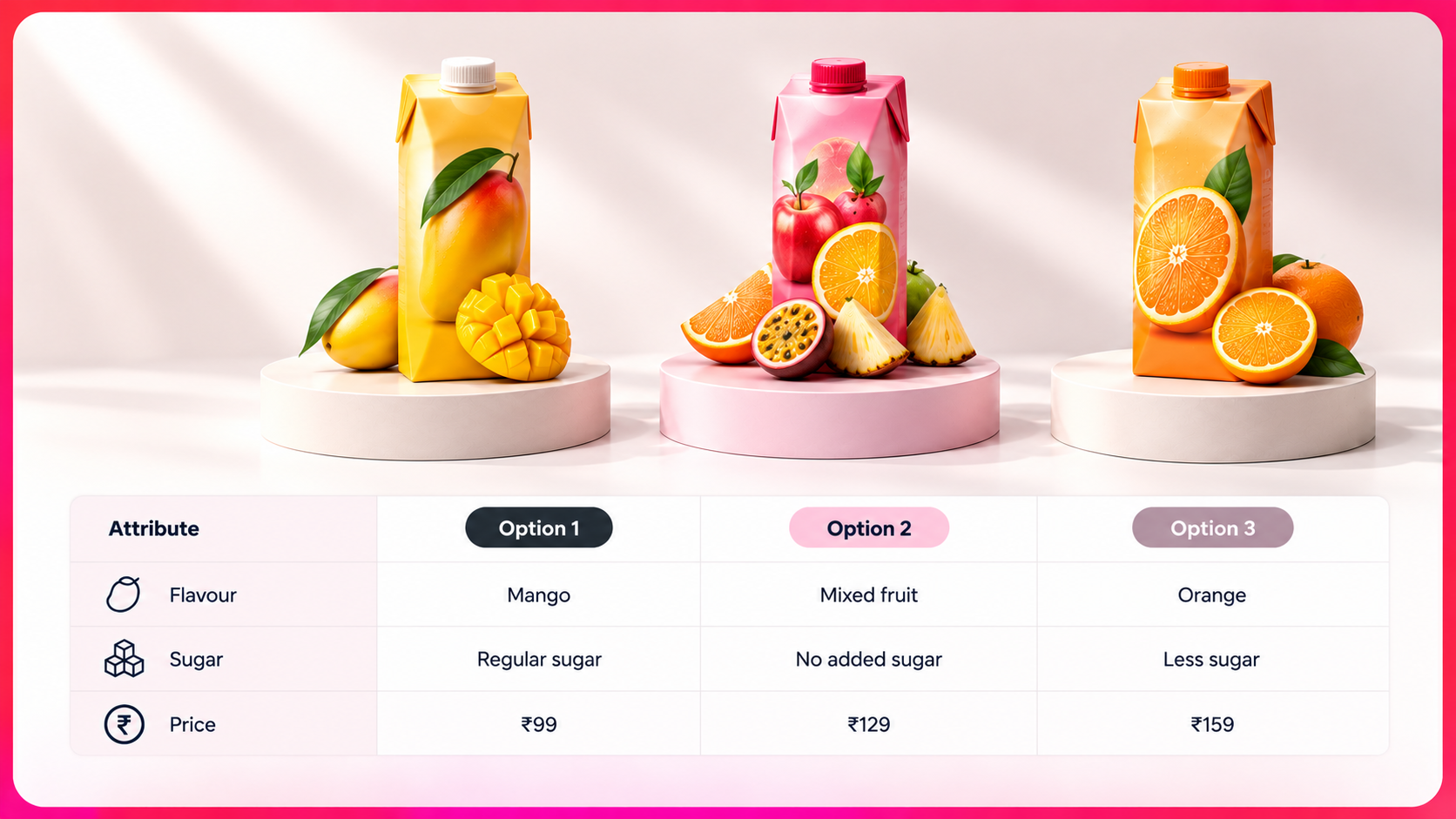
The respondent can also choose “I would not buy any of these.” On the next screen the combinations change, so the cheapest option might come with active noise cancellation and the most expensive with the shortest battery.
Each answer forces a trade-off. A respondent who picks the mixed fruit carton at ₹129 has decided that no added sugar is worth ₹30 more than regular sugar, even though they prefer mango. 12 choices from each of several hundred respondents give enough data to put a value on every level. The figures in the results section are illustrative and show how a study like this is read
Real-world examples of conjoint analysis
Conjoint analysis has shaped well-known products for more than fifty years:
- Courtyard by Marriott: Marriott used conjoint analysis to design a new hotel chain. The study guided which customer groups to target, how to position the hotels, and how to design their layout and services. Marriott built the Courtyard concept on these recommendations, tested it, and launched it nationally. The approach also changed how Marriott developed new products from then on.
- The scale of the Marriott study: Marriott hired Paul Green and Jerry Wind to run a large consumer study among business and leisure travellers. Courtyard grew from three hotels in 1983 to about 450 worldwide.
- Fairfield Inn: Marriott later used the same approach to design its Fairfield Inn chain.
- Bissell: Paul Green’s first commercial conjoint study was for Bissell, a maker of spot cleaning equipment that wanted to design a new kind of product container.
The same method works for consumer brands today, from setting the price of a new pack size to deciding which features earn a place in the next model.
How to read conjoint analysis results
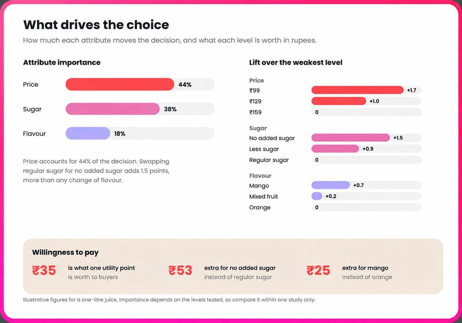
Conjoint analysis results come in layers: Part-worth utilities, attribute importance, willingness to pay and the market simulator. Each one builds on the one before it.
| Attribute | Level | Part-worth utility |
|---|---|---|
| Price | ₹99 | +0.8 |
| Price | ₹129 | +0.1 |
| Price | ₹159 | −0.9 |
| Sugar | No added sugar | +0.7 |
| Sugar | Less sugar | +0.1 |
| Sugar | Regular sugar | −0.8 |
| Flavour | Mango | +0.4 |
| Flavour | Mixed fruit | −0.1 |
| Flavour | Orange | −0.3 |
Attribute importance shows how much each attribute drives the decision. It is worked out from the gap between the highest and lowest utility within each attribute. Price spans 1.7, sugar 1.5 and flavour 0.7, a total of 3.9. That makes price 44% of the decision, sugar 38% and flavour 18%.
Willingness to pay turns utilities into rupees using the price attribute. A ₹60 price difference is worth 1.7 utility points, so each point is worth about ₹35. Moving from regular sugar to no added sugar is worth 1.5 points, or about ₹53 to buyers. Moving from orange to mango is worth about ₹25.
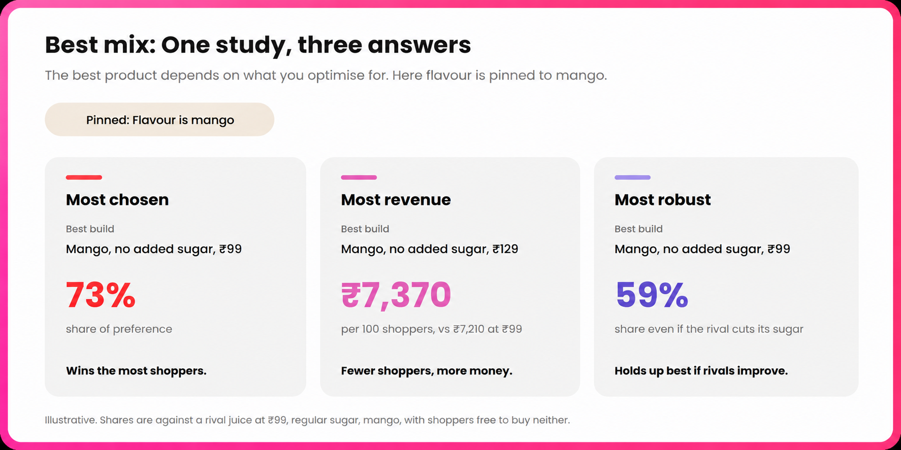
The best mix searches every possible product for the strongest one, and the answer depends on the goal. With flavour fixed at mango, mango with no added sugar at ₹99 wins the most shoppers. The same juice at ₹129 makes the most money, because the higher price more than makes up for the smaller share. When rivals improve, the ₹99 version holds up best. Read attribute importance with care. It depends on the levels tested, so a wider price range would make price look more important. Compare importance within one study, never across studies.
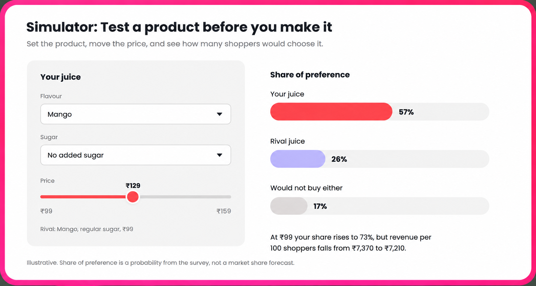
The simulator predicts how a product would perform against rivals, including shoppers who would buy neither. Mango juice with no added sugar at ₹129 scores 1.2. A rival mango juice with regular sugar at ₹99 scores 0.4. The simulator predicts that 57% of shoppers would choose yours, 26% the rival and 17% neither. Drop your price to ₹99 and your share rises to 73%, but revenue per 100 shoppers falls from about ₹7,370 to ₹7,210.
How to design a conjoint analysis survey
Most conjoint studies that fail do so at the design stage, before any data comes in. A strong conjoint analysis survey follows six rules:
- Choose attributes the brand can act on: Every attribute should be a real decision, such as a price or a feature that could be added or removed.
- Keep the attribute count tight: Flickly supports 2 to 8 attributes, each with 2 to 8 levels. Beyond about 6, respondents start choosing on one or two features and ignoring the rest.
- Keep level counts similar across attributes: An attribute with many more levels than the others looks more important simply because it has a wider range.
- Make levels clear and believable: “No added sugar” is clear, while “healthier” is not. Rule out any pairing a brand could never sell, but keep these exclusions few.
- Set the price range wide enough: If the price buyers would actually accept sits outside the levels tested, the study can’t find it.
- Include a none option: Without it, every respondent must pick something, which overstates how many people would buy at all.
- Watch the length: Each screen takes about 28 seconds, so 12 screens take around six minutes. Keep the conjoint section under seven minutes.
- Survey real buyers: Screen respondents to people who buy in the category, and remove rushed or careless answers before analysis.
How many respondents does a conjoint analysis need?
A conjoint analysis generally needs about 400 respondents, and should not go below 250. Below 250, results for separate groups such as metro and Tier 2 buyers stop being reliable. Each group reported separately needs at least 100 to 200 respondents of its own. The right sample size grows with the design. Flickly checks that each estimate in the model rests on at least 50 observations, and warns when a design falls short. More attributes, more levels or fewer screens per person all raise the number of respondents needed. Sawtooth Software has a widely used rule of thumb for the absolute minimum. Multiply 500 by the largest number of levels for any attribute, then divide by the number of screens multiplied by the number of options per screen. For the juice study, that is 500 × 3 ÷ (10 × 3), or 50 respondents, counting only the 10 screens used to build the model. That is a floor, well below the practical minimum of 250.
When to use conjoint analysis
Conjoint analysis works best for a considered purchase between similar options, where the features are concrete and the buyer understands what they are choosing between. In marketing research, it is the standard method for five decisions:
- Pricing: Finding the price that balances appeal and revenue, and how much each feature is worth.
- Feature priorities: Deciding which features to build first and which to drop.
- Pack and bundle design: Choosing pack sizes, variants or bundles that buyers prefer.
- New product launches: Predicting how a new product would perform against existing options.
- Competitive response: Estimating how buyers would react if a competitor changed its price or features.
Conjoint analysis vs MaxDiff and Van Westendorp
Conjoint analysis, MaxDiff and Van Westendorp all measure preference, but each answers a different question.
| Method | What respondents do | What it answers | Handles price |
|---|---|---|---|
| Conjoint analysis | Choose between complete product options | Which combination of features and price wins, and what each feature is worth | Yes, as one attribute among several |
| MaxDiff | Pick the best and worst item from small sets | Which items on a list matter most | No |
| Van Westendorp | Answer four questions about price | What price range buyers find acceptable for the whole product | Yes, for the product as a whole |
The three work well together. MaxDiff can narrow a long feature list to the few that matter, and Van Westendorp can set a sensible price range. Conjoint analysis can then test the final features at prices within that range.
Running conjoint analysis on Flickly
Flickly runs choice-based conjoint studies for consumer brands, from survey design to simulation, on a panel of more than 65 million verified consumers. Findings arrive in 72 hours. Brands can build a study themselves or have Flickly’s research team design and run it for them.
- Products shown as packs: Each option appears as a pack drawn in one of 19 shapes across skincare, food, beverages and appliances. Each attribute is printed in its own place on the pack, such as the price in a roundel on the shoulder.
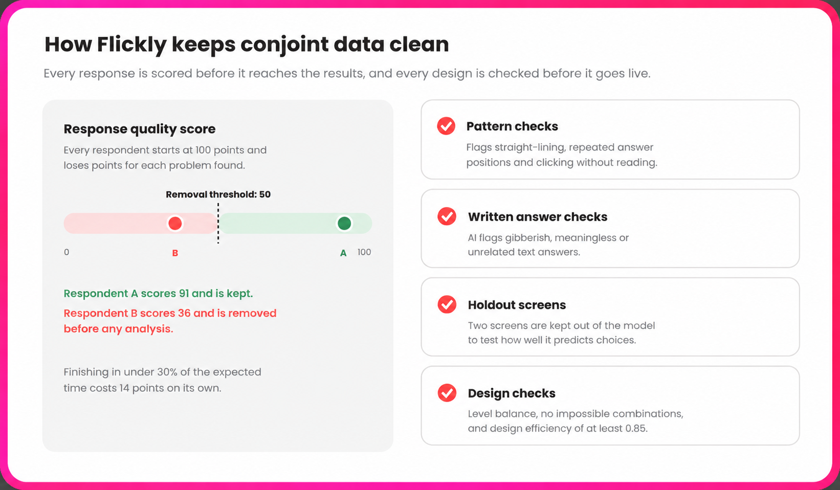
- Design checks before launch: Flickly checks level balance, blocks impossible combinations and requires a design efficiency of at least 0.85.
- Holdout screens: Two screens are kept out of the model to test how well it predicts real choices.
- Response quality scoring: Every respondent starts at 100 points and loses points for rushing, repeated answer patterns and careless answers. Anyone below 50 is removed before analysis.
- Preference Lab: Results open in dedicated views for what drives choice, the best mix, how combinations perform together, a ranked list of every possible product, and a simulator.
Frequently asked questions


Run your next study with verified Indian consumers
Design the study, reach the right respondents, and get decision-ready insights in 72 hours.